

-
26 y.o. teenager from broward county, catching a vibe in miami, trying to find areas & communities where i can make an impact
-
in a world where everyone wants to be a creative… not everyone is willing to do what it takes to be that creative. people should really lose there ego nowadays, it’s so unflattering.
-
big metal machines on wheels and the color yellow
-
below are selects of my works over the last 10 years that i felt were worth showing… this must be like 0.2% of what I’ve touched/worked on in my history, so i guess we can say im pretty particular in what i really like
___hey...im_sam_:)___
___what brings u here___
___hey...im_sam_:)___ ___what brings u here___
have a scroll!
if you’re on desktop - hit middle mouse and let it scroll for u :) mobile users… i worked hard to make this look good for you
highlight reel?
these are closer to my favorites

Loliiipop | iiipoints x The Flowery Merch Role: Direction/Execution

Project: Scarr's Pizza Popup at Flowery BK Role: Direction/Execution

Project: Nature Meets Nitro Role: Direction/Execution

Zaaaloc | iiipoints x The Flowery Merch Role: Direction/Execution

Project: Coolboi Single Cover Role: Direction/Execution

Project: Misc Flowery Logo Hits Role: Design

Semi Radical Stoney Society Role: Designer

Project: Pro Bono Local Branding for Charlie's BBQ in Homestead FL
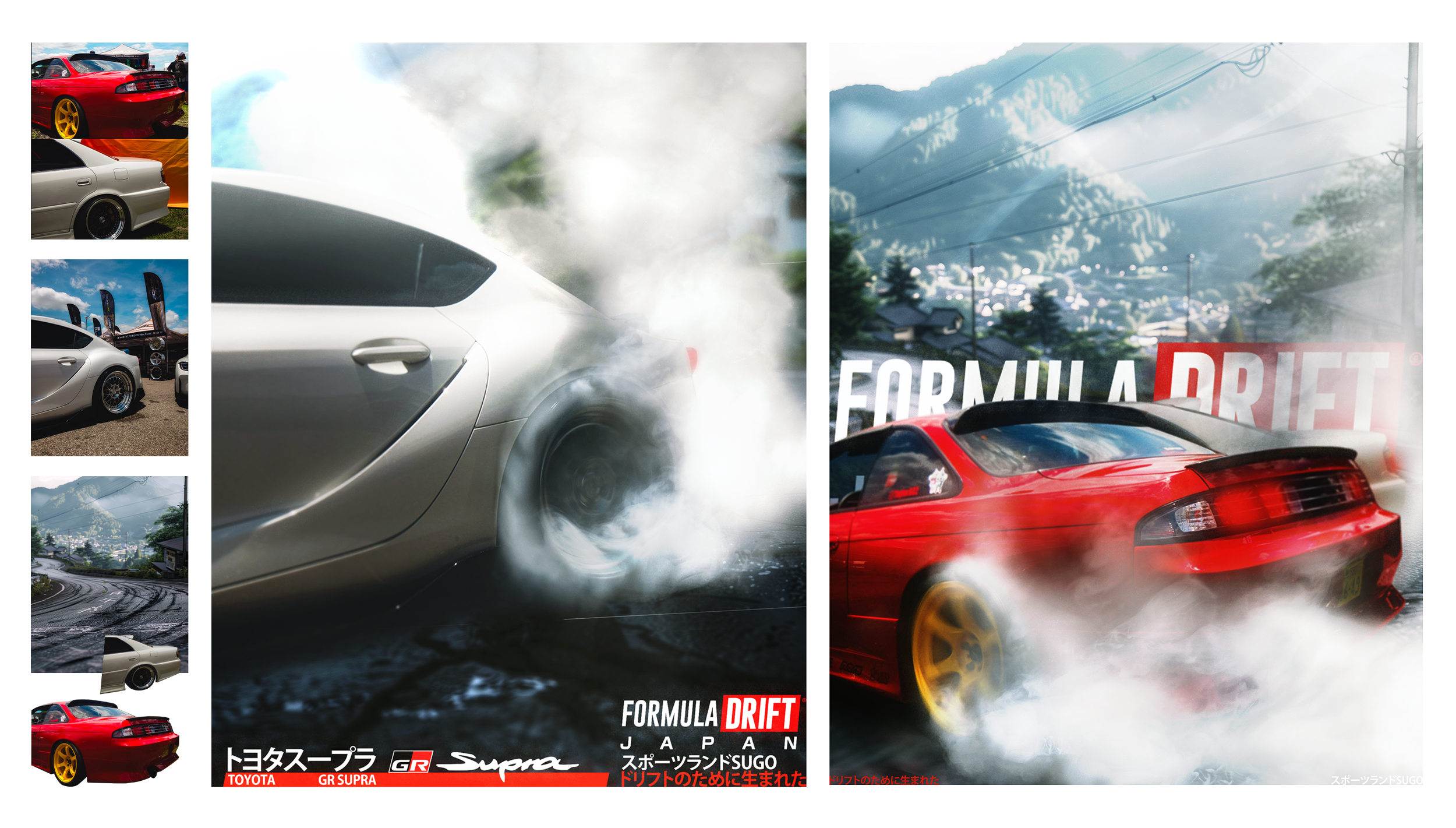
Project: Formula Drift Manipulation Experiment

Project: Flowery Venice Grand Opening Role: Direction/Execution

Art From The Above Ground Role: Designer
___the_following_projects_below_are_better_viewed_landscapefo:)____
___the_following_projects_below_are_better_viewed_landscapefo:)____

homixide gang
i5u5we5
tour merch (2023)
worked with rekluse house under jobe and had full creative freedom designing merch for homixide gang’s i5u5we5 tour. pushed into their raw edgy world with sharp cuts heavy textures and chaotic details that matched the energy of their sound and live shows.
___peep_this_total_mood_change_tho___
___peep_this_total_mood_change_tho___

bunny’s
bae bar
conceptual design (2020-2025)
working on bunny’s bae bar at rolling loud was one of those projects that stuck with me. me and bunny had worked together for four years, basically design besties the whole time, and i was her technical hands while she shaped the vision, helping bring her ideas to life for the women that pull up to the festival. from the brand identity to the boutique-style installation, it was about creating a space that felt intentional and stylish, not just another booth. seeing it grow into the forever 21 partnership later on made it feel even more full circle.

schnitz livery
mark1 rabbit gti
thomas hollad - throttle house
throttle house desert series a side project i did after watching thomas and james take their cars out in the desert. thomas’s mk1 rabbit didn’t have a livery like james’s ae86 tofu so i made some concepts for him using schnitz and tofu as anchors. nothing official, just me having fun with it and showing how much i’m inspired by cars and the culture around them.
___sorry_if_u_ended_up_doomscrolling___
___sorry_if_u_ended_up_doomscrolling___
______________hoped you enjoyed some of my mania :)______________
______________hoped you enjoyed some of my mania :)______________

trevon diggs
brand identity – (2023)
this was a cool project to be a part of, helping with the full art direction on trevon diggs’ brand, we were able to build a bold mark that feels fast, sharp, and dynamic—like his game. the angular cuts and motion-based type push that sense of speed and precision, giving the identity a strong presence across logos, merch, and digital.
note:_looking_thru_my_archive_is_exhausting___lol____
note:_looking_thru_my_archive_is_exhausting___lol____

flowery fest
new york city
all gas no breaks (2025)
well this was an easy one lol. having coming straight from rl previously, it was easy to develop the identity for the first ever flowery fest that went down in nyc. was able to design the full identity, merch, posters, stage art, and graphics; all in a single day. the look was playful and colorful, pulling from old festival posters and sticker bomb culture, mixing doodles, type-driven logos, and bright curved shapes that tied everything together. the vibe was loud, fun, and approachable, meant to stand out both on a t-shirt and on a wall in the city.
______________tanks for making it this far :)______________
______________tanks for making it this far :)______________

rolling loud
europe
festival merch (2024)
working on rolling loud europe 2024 merch was such a vibe. this project was all about capturing that euphoric, chaotic energy you feel walking into the festival, the kind of stuff that hits you in the chest and sticks with you. got to play with visuals that feel alive, raw, and a little wild, making merch that actually channels the emotions of the moment.
______________tanks for making it this far :)______________
______________tanks for making it this far :)______________

zauce seltzer
non flowery product
from the flowery (2023)
Zauce a hemp-based seltzer concept for The Flowery, built to stand out on the shelf with swirvy, curved vibes. Inspired by Happier Grocery in NYC, the design played with flow and movement to match the product’s feel. With preformative mushrooms in the mix, the goal was simple; make it eye-catching, fun, and wavy in both look and effect.

crochet
byktmae
catnip-raviolis(2025)
personal friend project that came out super dope. i made a ravioli can design for catnip-filled raviolis, with the talented skills from @ktmaesec, we began riffing off vintage chef boyardee & wanted to bring back that rolling can vibe but flipped for cats chasing cans outside petco. i sourced the cans, printed stickers, & together we made the whole thing real.
_____almost_done_i_pinky_promise_________
_____almost_done_i_pinky_promise_________

years living
a kid’s dream
@rolling loud
dream job that manifested itself after going to my first rolling loud in 2019. nine months later, right as covid hit, i started working with them on streaming festivals. from there and kept growing inside the brand, eventually leading all design projects from 2021 through the end of 2023. being trusted with building a team with @aaa_grphcs as my 2nd set of hands, and @mb3music as our 3D goat, we were able to conqure anything and everything; and what an honor that was. Aiming for no boundaries on what could be done gave me the chance to really sharpen my voice as a designer. Sadly, over time, realizing i had outgrown the role, there was more wanted for myself and for the kind of work i create, but the years i spent with the team will always feel like family.

my last
pitch 4 rl
playing off their recent rebrand, this last pitch was all about pushing more color into the designs. i felt like the work was missing the emotional punch that color brings, so i built a direction around it. at first it didn’t land, but later they shifted their perspective and leaned into the exact approach i was pushing for. it was one of those moments where i knew my eye was in the right place, even if the timing wasn’t.